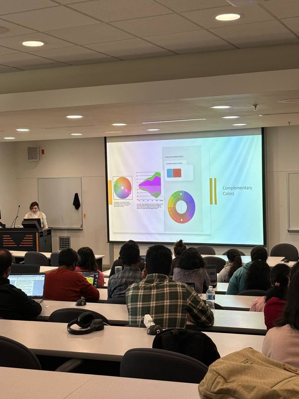

I had the privilege of serving as a guest lecturer at the Naveen Jindal School of Management (JSOM) at the University of Texas at Dallas, where I led an interactive session on the principles of color psychology and its role in effective data visualization. This lecture was requested as part of a boot camp for business and finance students, with the goal of introducing design thinking into data-driven fields. Many participants came from backgrounds where visual communication and color theory are not formally taught, so the session focused on how color choices can significantly influence interpretation, emphasis, and meaning within charts and datasets.
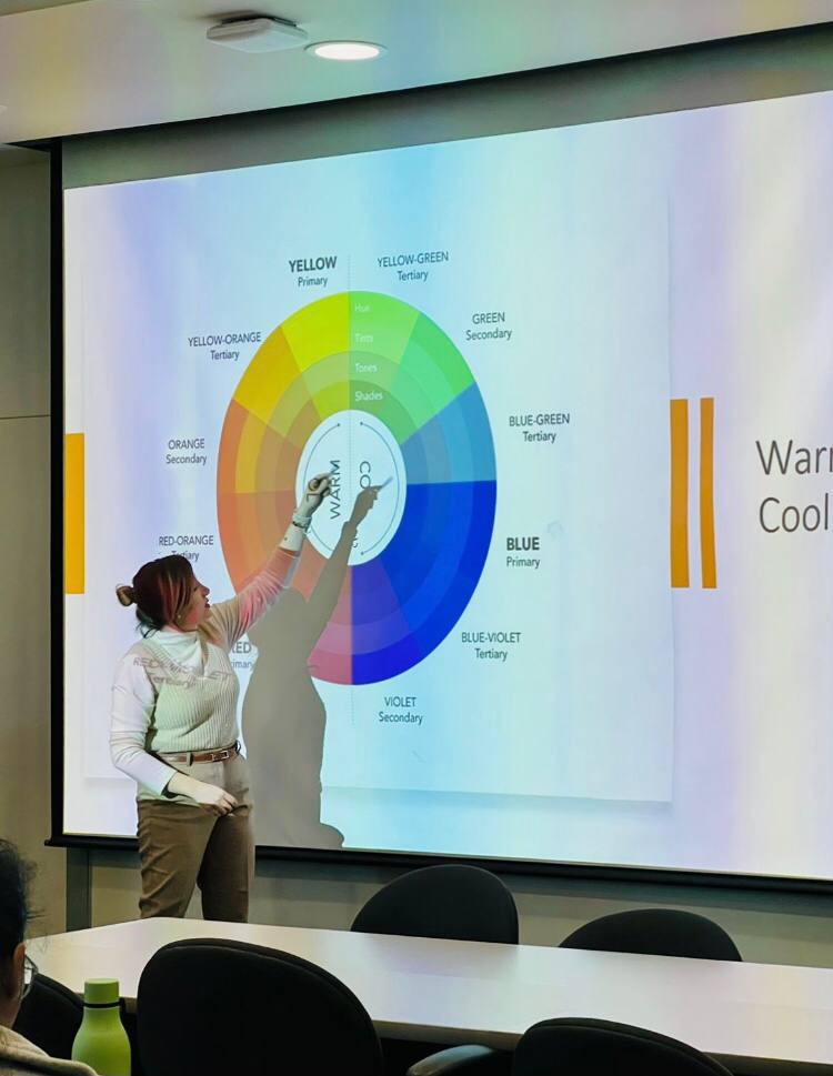
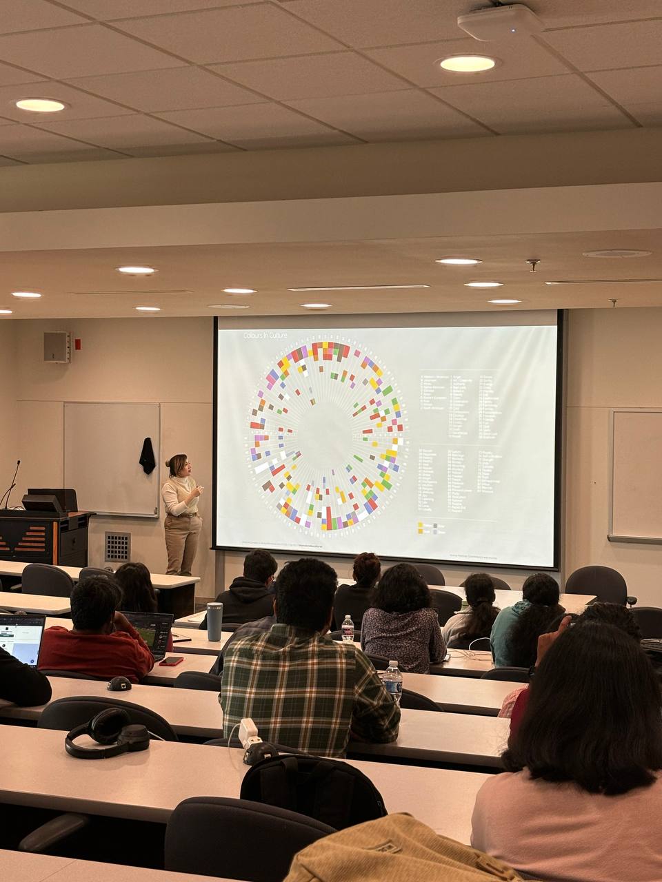
By exploring the psychological impact of color, I demonstrated how thoughtful color selection and strategic color coding can improve clarity, guide the viewer’s attention, and make complex information easier to navigate. Through real-world examples and applied exercises, the session highlighted how even small color adjustments can strengthen storytelling, reduce misinterpretation, and enhance the overall effectiveness of data presentations. The lecture aimed to bridge the gap between analytical rigor and visual communication, empowering students to present insights more clearly, confidently, and persuasively.